I love documenting my tasks ahead of time.
For years my go-to system has been Kanban. I plan work visually, move tasks across stages, and keep everything organized that way.
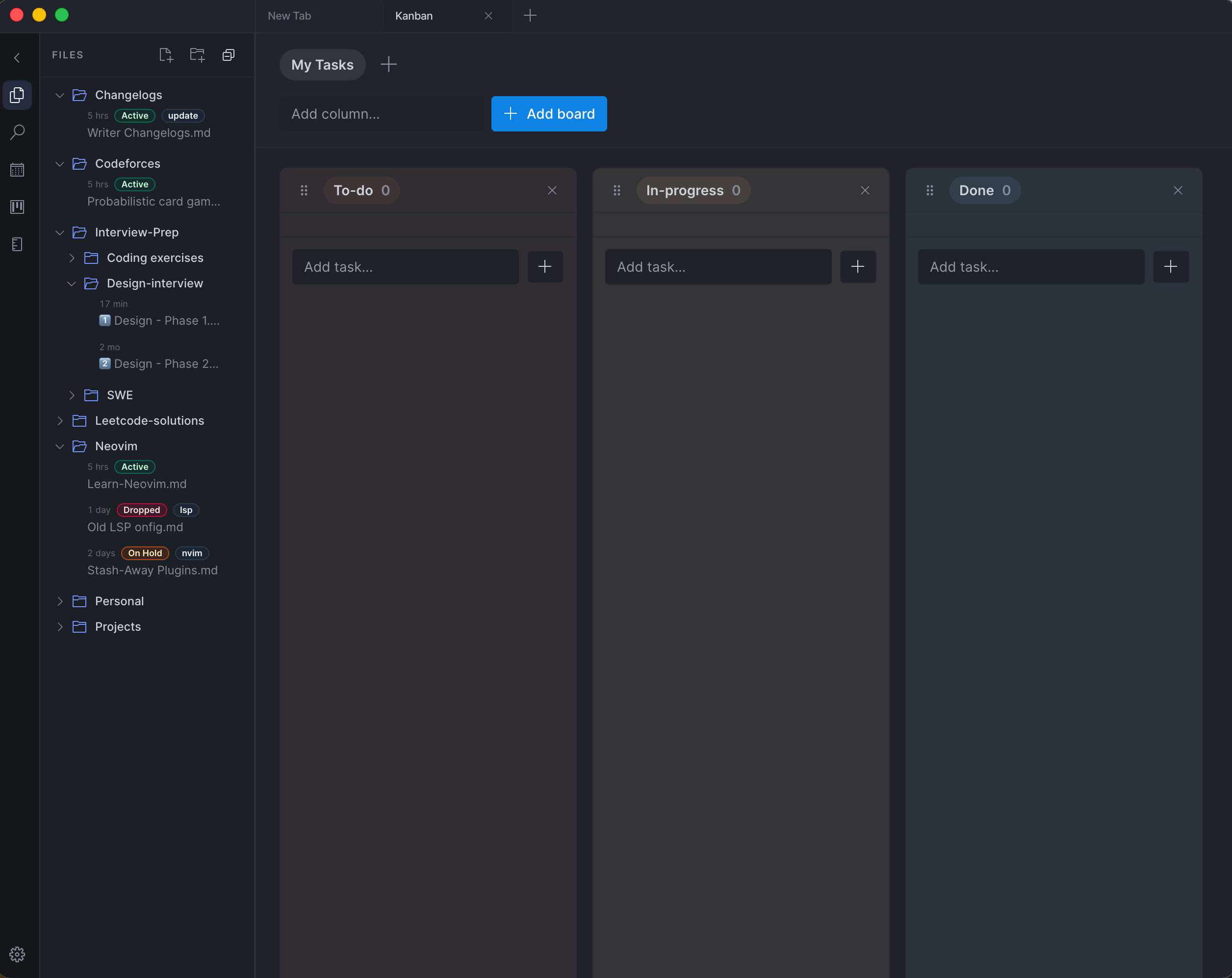
Because I rely on it so much, I’ve started improving the Kanban board experience inside my own app.
Right now there are only 2 active users — but honestly that makes it the perfect environment to experiment and iterate fast.
Over the past few weeks I’ve been working on a few UX improvements:
• Dynamically assigned color schemes for each board so every workspace has its own visual identity • Tabbed workspaces so switching between projects feels fast and natural • Seamless board and task switching so users can jump contexts without losing flow
Simple features on the surface.
But while building them, I realized something interesting:
A lot of the tiny interactions we take for granted in mature products are actually very hard to implement well.
Those small details are what make tools feel fast, intuitive, and effortless.
Here are some of the technical challenges that came up while implementing these features.
1. State synchronization across multiple boards and workspaces #
When a user switches between boards or workspaces, several pieces of state must stay consistent:
• active board • selected task • scroll position • drag state • column expansion states
The tricky part is preventing unnecessary re-renders while keeping everything reactive.
I had to carefully structure state so that:
• board-level state stays isolated • global workspace state remains accessible • UI transitions don’t reset local interactions
Otherwise switching boards could cause the UI to flicker or reset user context.
2. Maintaining drag-and-drop performance #
Drag-and-drop Kanban boards look simple but can become expensive quickly.
Every task movement can trigger:
• DOM updates • state recalculations • layout shifts • persistence updates
If not handled carefully, dragging a card across columns can feel laggy.
Some strategies I experimented with:
• memoizing task components • minimizing layout thrashing • optimistic UI updates before persistence • batching state updates during drag operations
Even small inefficiencies become visible when you drag dozens of tasks rapidly.
3. Preserving user context during navigation #
When switching between boards, a good UX preserves context.
For example:
• which task was open • which column the user was interacting with • scroll position within the board
Without careful handling, navigation resets everything and breaks the user’s mental flow.
I implemented state persistence and restoration so returning to a board restores its last interaction state.
4. Data modeling for scalable workspaces #
Adding workspaces introduces another layer of complexity:
Workspace → Boards → Columns → Tasks
Designing this hierarchy required thinking about:
• efficient querying • quick board switching • minimal data loading • avoiding tight coupling between entities
Even though the current user count is tiny, building the model in a scalable way avoids painful refactors later.
5. Optimistic UI for fast interactions #
Users expect actions like:
• moving a task • editing a title • switching boards
to feel instant.
So instead of waiting for persistence (database / API), the UI updates immediately and syncs afterward.
But that introduces edge cases:
• failed updates • conflicting states • undo behavior
Handling these cases without breaking the UI flow takes extra care.
What this project reminded me is simple:
The best software hides complexity behind tiny interactions.
The smoother something feels, the more engineering effort probably went into it.
Still a lot to refine, but improving these small UX details has been a fun challenge.
And honestly, building tools you use yourself is one of the best ways to learn.